Ui Module
This module provide same plate :
-
widgetinclude:TextViewquick set boder and boderButtonhave touch press buttonFloatActionButtonhave shadow buttonCheckBoxhave click animationEditTexta MD line editImageViewthe imageview support touch pressSeekBarhave move popup view seekbarLoadingloading progress widget
drawableThis is widget drawable and same abs class.ui kitIt have font, color, attr and size convert.
First
// First of all specified in the root container:
<YourLayout
    ...
    xmlns:app="http://schemas.android.com/apk/res-auto"/>
Widget
TextView

<net.qiujuer.genius.ui.widget.TextView
    ...
    android:text="Border TB"
    app:gFont="roboto.ttf"
    app:gBorder="top|bottom"
    app:gBorderColor="@color/teal_500"
app:gBorderSize="1dp" />gFont: Set text font file name, the path’s “assets\fonts\roboto.ttf”.gBorder: Set show border, you can set:all,top,top|bottom- all
- left, top, right, bottom.
gBorderColor: Set border color, you can set:@color/teal_500or#ff000000.gBorderSize: Set border size, the unit is dp.
Button
 <net.qiujuer.genius.ui.widget.Button
    ...
    android:background="@drawable/g_button_background"
    app:gFont="roboto.ttf"
    app:gTouchColor="@color/black_alpha_224"
    app:gTouchEffect="auto"
    app:gTouchCornerRadius="@dimen/lay_12"
    app:gTouchCornerRadiusTL="@dimen/lay_16"
    app:gTouchCornerRadiusTR="@dimen/lay_16"
    app:gTouchCornerRadiusBL="@dimen/lay_16"
    app:gTouchCornerRadiusBR="@dimen/lay_16"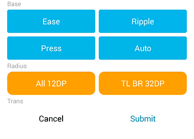
app:gTouchDurationRate="0.7" />gFont: See textview xml.gTouchColor: Set the touch press color, you can set:@color/black_alpha_64or#80000000.gTouchEffect: Set the touch press type, include:- none Not have touch effect.
- auto This effect is default by MD, spread from your touch point.
- ease This is Gradually fade effect.
- press The spread effect from center.
- ripple This is ripple effect.
gTouchCornerRadius: Set the touch effect edge corner radius, this is set four corners.gTouchCornerRadiusTL: Set the corner radius between top and left.gTouchCornerRadiusTR: Set the corner radius between top and right.gTouchCornerRadiusBL: Set the corner radius between bottom and left.-
gTouchCornerRadiusBR: Set the corner radius between bottom and right.In this, if you set gTouchCornerRadius=”12dp” and gTouchCornerRadiusTL=”16dp”,
The four corners of the rectangle are 16, 12, 12, 12, respectively. -
gTouchDurationRate: Set touch press speed. If need fast you can set0.0~1.0; if you need slow, you can set1~10Default 1.0, EnterDuration=280ms, ExitDuration=160ms
FloatActionButton
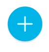
<net.qiujuer.genius.ui.widget.FloatActionButton
    ...
    android:id="@+id/action_add"
    app:gBackgroundColor="@color/cyan_500"
app:gTouchColor="@color/black_alpha_64"/>gBackgroundColor: If you want change bg color, you need use it. you can set:@color/cyan_500or#aa000000.gTouchColor: Set the touch press color, you can set:@color/black_alpha_64or#80000000.
You can add create drawable in the src by java:
private void initFloatActionButton() {
    final float density = getResources().getDisplayMetrics().density;
    FloatActionButton addButton = (FloatActionButton) findViewById(R.id.action_add);
    AddLineShape lineShape = new AddLineShape();
    ShapeDrawable drawable = new ShapeDrawable(lineShape);
    Paint paint = drawable.getPaint();
    paint.setStyle(Paint.Style.STROKE);
    paint.setAntiAlias(true);
    paint.setDither(true);
    paint.setColor(0xc0ffffff);
    paint.setStrokeCap(Paint.Cap.ROUND);
    paint.setStrokeWidth(2 * density);
    drawable.setIntrinsicWidth(100);
    drawable.setIntrinsicHeight(100);
    addButton.setImageDrawable(drawable);
}
The AddLineShape in this.
CheckBox
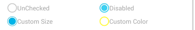
<net.qiujuer.genius.ui.widget.CheckBox
    ...
    android:background="@null"
    app:gFont="roboto.ttf"
    app:gBorderSize="1dp"
    app:gIntervalSize="2dp"
    app:gMarkSize="22dp"
app:gMarkColor="@color/m_check_box" />gFont: See textview xml.gBorderSize: Set ring drawable size.gIntervalSize: Set ring to circle interval size.gMarkSize: Set mark drawable size; if you not set, the size is Math.min(width, hight).gMarkColor: Set mark color, the color allow set ColorStateList.#ff000000@color/black_alpha_64color drawable:
<selector xmlns:android="http://schemas.android.com/apk/res/android">
    <item android:color="@color/grey_400" android:state_checked="false" android:state_enabled="true" />
    <item android:color="@color/grey_300" android:state_checked="false" android:state_enabled="false" />
    <item android:color="@color/cyan_500" android:state_checked="true" android:state_enabled="true" />
    <item android:color="@color/cyan_300" android:state_checked="true" android:state_enabled="false" />
</selector>
EditText
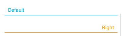
<net.qiujuer.genius.ui.widget.EditText
    ...
    app:gFont="roboto.ttf"
    app:gHintTitle="slide"
    app:gHintTitlePaddingBottom="2dp"
    app:gHintTitlePaddingLeft="0dp"
    app:gHintTitlePaddingRight="0dp"
    app:gHintTitlePaddingTop="0dp"
    app:gHintTitleTextSize="14sp"
    app:gLineColor="@color/m_edit_view_line"
app:gLineSize="2dp" />gFont: See textview xml.gHintTitle: Set Hint title style type:- none Not hava hint.
- slide Slide show title, this is Deafault.
gHintTitlePaddingBottom: Set title padding bottom.gHintTitlePaddingLeft: Set title padding left, if align left, default by TextView padding left.gHintTitlePaddingRight: Set title padding right, if align right, default by TextView padding right.gHintTitlePaddingTop: Set title padding top.gHintTitleTextSize: Set title text size.gLineColor: Set EditText bottom line color.gLineSize: Set EditText bottom line size.
ImageView
 <net.qiujuer.genius.ui.widget.ImageView
    ...
    app:gTouchColor="@color/black_alpha_224"
    app:gTouchEffect="auto"
    app:gTouchCornerRadius="@dimen/lay_12"
    app:gTouchCornerRadiusTL="@dimen/lay_16"
    app:gTouchCornerRadiusTR="@dimen/lay_16"
    app:gTouchCornerRadiusBL="@dimen/lay_16"
    app:gTouchCornerRadiusBR="@dimen/lay_16"
app:gTouchDurationRate="0.7" />gTouchColor: Set the touch press color, you can set:@color/black_alpha_64or#80000000.gTouchEffect: Set the touch press type, see Button attr, default none.gTouchCornerRadius: Set the touch effect edge corner radius, this is set four corners.gTouchCornerRadiusTL: Set the corner radius between top and left.gTouchCornerRadiusTR: Set the corner radius between top and right.gTouchCornerRadiusBL: Set the corner radius between bottom and left.gTouchCornerRadiusBR: Set the corner radius between bottom and right.gTouchDurationRate: Set touch press speed. you must>0.0, see Button attr.
SeekBar
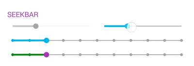
 <net.qiujuer.genius.ui.widget.SeekBar
    ...
    app:gFont="roboto.ttf"
    app:gMax="10"
    app:gMin="0"
    app:gValue="2"

    app:gIndicator="auto"
    app:gIndicatorTextPadding="2dp"
    app:gIndicatorBackgroundColor="@color/m_seek_bar_indicator_bg"
    app:gIndicatorFormatter="(∩_∩)%d"
    app:gIndicatorSeparation="14dp"
    app:gIndicatorTextAppearance="@style/Genius.Widget.BalloonMarker.TextAppearance"

    app:gRippleColor="@color/m_seek_bar_ripple"
    app:gScrubberColor="@color/m_seek_bar_scrubber"
    app:gScrubberStroke="4dp"
    app:gThumbColor="@color/m_seek_bar_thumb"
    app:gThumbSize="6dp"
    app:gTickSize="3dp"
    app:gTouchSize="12dp"
    app:gTrackColor="@color/grey_500"
    app:gTrackStroke="2dp"

    app:gMirrorForRtl="true"
app:gAllowTrackClickToDrag="true"/>gFont: See textview xml.gMax: Set seekbar max value, the value must greater thangMinvalue.gMin: Set seekbar min value, the value must less thangMaxvalue.gValue: Set the progress value, the value betweengMinandgMax.gIndicator: This’s seekbar popup view, set the type.nonenot show popup view.autoif user move progress the view will show.alwaysthe view always show, in development.
gIndicatorTextPadding: The popup text view padding.gIndicatorBackgroundColor: The popup view background.gIndicatorFormatter: The popup textview formatter, eg:(∩_∩)%d,-_-%dor^%d^.gIndicatorSeparation: The popup float height.gIndicatorTextAppearance: If you need custom textview style, you can set it. This’s style xml.
<style name="Genius.Widget.BalloonMarker.TextAppearance" parent="android:TextAppearance.Small">
    <item name="android:textColor">?android:attr/textColorPrimaryInverse</item>
</style>gThumbColor: Set seekbar thumb color.gThumbSize: Set seekbar thumb diameter size.gTouchSize: On state is active will show a circle, the circle will follow finger movement. This’s set the circle diameter size.gRippleColor: On you touch the thumb, seekbar will to active state and ripple a circle. This’s set ripple color.-
gTickSize: Set seebkar value of the tick point diameter size. gScrubberColor: This’s seekbar foreground line color.gScrubberStroke:This’s seekbar foreground line size.gTrackColor: This’s seekbar background line color.-
gTrackStroke: This’s seekbar background line size. gMirrorForRtl: If want let seekbar draw right to left, you can setfalse, default istrue.gAllowTrackClickToDrag: Allows to change the value of the progress bar. default istrue. if you setfalse, you can only move thumb to change the progress value.
Loading
 <net.qiujuer.genius.ui.widget.Loading
    ...
    app:gBackgroundLineSize="1dp"
    app:gForegroundLineSize="3dp"
    app:gBackgroundColor="@color/yellow_500"
    app:gForegroundColor="@color/deep_orange_500"
    app:gProgressFloat="0.65"
app:gAutoRun="false"/>gBackgroundLineSize: The loading line background size.gForegroundLineSize: The loading line foreground size.gBackgroundColor: The loading line background color.gForegroundColor: The loading line foreground color.gProgressFloat: If you need hava progress set it. the value0.0~1.0, if you set it, the loading isn’t running.gAutoRun: Show the widget, auto running, default is true.
Extend
If you want to use the button click effect on other controls. You can do:
One
Cretate new custom control, in this extends FrameLayout
import android.content.Context;
import android.util.AttributeSet;
import android.widget.FrameLayout;

public class CustomControl extends FrameLayout {
    public CustomControl(Context context) {
        super(context);
    }

    public CustomControl(Context context, AttributeSet attrs) {
        super(context, attrs);
    }

    public CustomControl(Context context, AttributeSet attrs, int defStyleAttr) {
        super(context, attrs, defStyleAttr);
    }

    public CustomControl(Context context, AttributeSet attrs, int defStyleAttr, int defStyleRes) {
        super(context, attrs, defStyleAttr, defStyleRes);
    }
}
Two
Implements TouchEffectDrawable.PerformClicker, in this you can delay response button click.
import net.qiujuer.genius.ui.drawable.TouchEffectDrawable;
public class CustomControl extends FrameLayout implements TouchEffectDrawable.PerformClicker {
    TouchEffectDrawable mTouchDrawable;
    ...

    @Override
    public void perform() {
        Runnable runnable = new Runnable() {
            @Override
            public void run() {
                performClick();
            }
        };

        if (!this.post(runnable)) {
            performClick();
        }
    }

    @Override
    public boolean performClick() {
        final TouchEffectDrawable d = mTouchDrawable;

        if (d != null) {
            return d.isPerformClick() && super.performClick();
        } else
            return super.performClick();
    }
}
Three
Now you can init the drawable size and call draw.
import net.qiujuer.genius.ui.drawable.TouchEffectDrawable;
public class CustomControl extends FrameLayout implements TouchEffectDrawable.PerformClicker {
    TouchEffectDrawable mTouchDrawable;
    ...


    @Override
    protected void onSizeChanged(int w, int h, int oldw, int oldh) {
        super.onSizeChanged(w, h, oldw, oldh);
        TouchEffectDrawable drawable = mTouchDrawable;
        if (drawable != null) {
            drawable.setBounds(0, 0, getWidth(), getHeight());
        }
    }

    @Override
    protected boolean verifyDrawable(Drawable who) {
        Drawable drawable = mTouchDrawable;
        return (drawable != null && who == drawable) || super.verifyDrawable(who);
    }

    @Override
    protected synchronized void onDraw(Canvas canvas) {
        super.onDraw(canvas);

        // draw the effect on the image

        final TouchEffectDrawable d = mTouchDrawable;
        if (d != null) {
            d.draw(canvas);
        }
    }

    @Override
    public boolean onTouchEvent(MotionEvent event) {
        final TouchEffectDrawable d = mTouchDrawable;
        if (d != null && isEnabled()) {
            d.onTouch(event);
            super.onTouchEvent(event);
            return true;
        }

        return super.onTouchEvent(event);
    }
}
If you set the drawable to the view background, you don’t need onSizeChanged, verifyDrawable and onDraw.
import net.qiujuer.genius.ui.drawable.TouchEffectDrawable;
public class CustomControl extends FrameLayout implements TouchEffectDrawable.PerformClicker {
    TouchEffectDrawable mTouchDrawable;
    ...

    private void init() {
        ...
        setBackgrdound(mTouchDrawable);
    }

    @Override
    public boolean onTouchEvent(MotionEvent event) {
        final TouchEffectDrawable d = mTouchDrawable;
        if (d != null && isEnabled()) {
            d.onTouch(event);
            super.onTouchEvent(event);
            return true;
        }

        return super.onTouchEvent(event);
    }
}
End
Okey, in the end, you can init the TouchEffectDrawable, and call in your Constructor.
import net.qiujuer.genius.ui.drawable.TouchEffectDrawable;
public class CustomControl extends FrameLayout implements TouchEffectDrawable.PerformClicker {
    TouchEffectDrawable mTouchDrawable;
    ...

    public CustomControl(Context context) {
        super(context);
        init();
    }

    private void init() {
        if (mTouchDrawable == null) {
            mTouchDrawable = new TouchEffectDrawable();
            mTouchDrawable.setCallback(this);
            mTouchDrawable.setPerformClicker(this);
        }

        // set the touch effect

        mTouchDrawable.setEffect(new AutoEffect());
        //mTouchDrawable.setEffect(new EaseEffect());

        //mTouchDrawable.setEffect(new PressEffect());

        //mTouchDrawable.setEffect(new RippleEffect());


        // set the touch color

        mTouchDrawable.getPaint().setColor(0x30000000);

        // set the touch duration rate

        mTouchDrawable.setEnterDuration(0.8f);
        mTouchDrawable.setExitDuration(0.8f);

        if (!this.isInEditMode()) {
            float[] radius = new float[]{2, 2, 2, 2, 2, 2, 2, 2};
            ClipFilletFactory touchFactory = new ClipFilletFactory(radius);
            // ClipFilletFactory touchFactory = new ClipFilletFactory(2);


            // Touch factory

            mTouchDrawable.setClipFactory(touchFactory);
        }

        //setBackground(mTouchDrawable);

    }
}